Help Out The Cube Rev


Eddo from Posted Note has done a great job making some new templates for the blog, but I can't decide which one I like best and figured since you guys are the ones that have to look at this sight I'd leave it up to you. Whichever one gets the most votes will be the winnder.
posted by Out Of Jersey | 7:53 AM
![]()
![]()


14 Comments:
I really like the last one. It has sort of a simplicity to it that I think is really cool. Sort of a "hey, I'm so badass I don't even need a gimic," kind of look. Haha.
Completely off topic, but my sister-in-law just gave me a book called "Delaying The Real World" and on the back it says "The cubicle can wait for an adventure or two!" And I thought of you. Just wanted to let you know! :)
I like the first one. It has a look of serenity!
I'm with Frankie. Go with the last one. It's more you, I think.
The first or the third. for sure one of the two. I like the second one too though...
That counts as three votes.
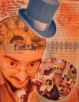
i like the green one, if only because it has your pic in it and that is so controversial of late on your blog here :)
The first one listed . . . that's the best one!
I like the first and third ones the best
hmmmm... I thought it was going to show me a larger image when I clicked on it... I wish they were a touch larger so people could see a little more detial - but I guess you can see them pretty good.
Looks like this could be a tough decision that ultimately comes down to what you like.
Either way, this is a fun way of deciding.
I vote for the second one.
I love the first one.
I vote for the last one. All black with white print. It will be easy to read.
the third one...I like the "one of god's office supplies" line.
I vote green. :)
Even though I voted for the second option, I must say I might indeed even like the first option better in the end!!! So excellent choice, Cubicle Reverend.
Post a Comment
<< Home